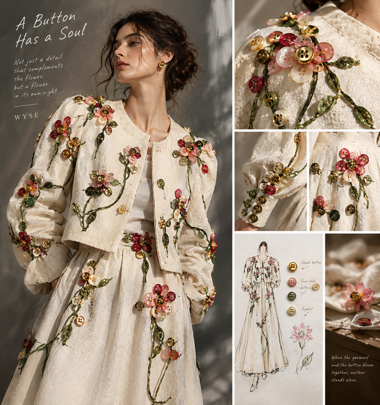
What If the Button Were the Flower?
What If the Button Were the Flower?
Some buttons do more than hold a garment together. They give it character.
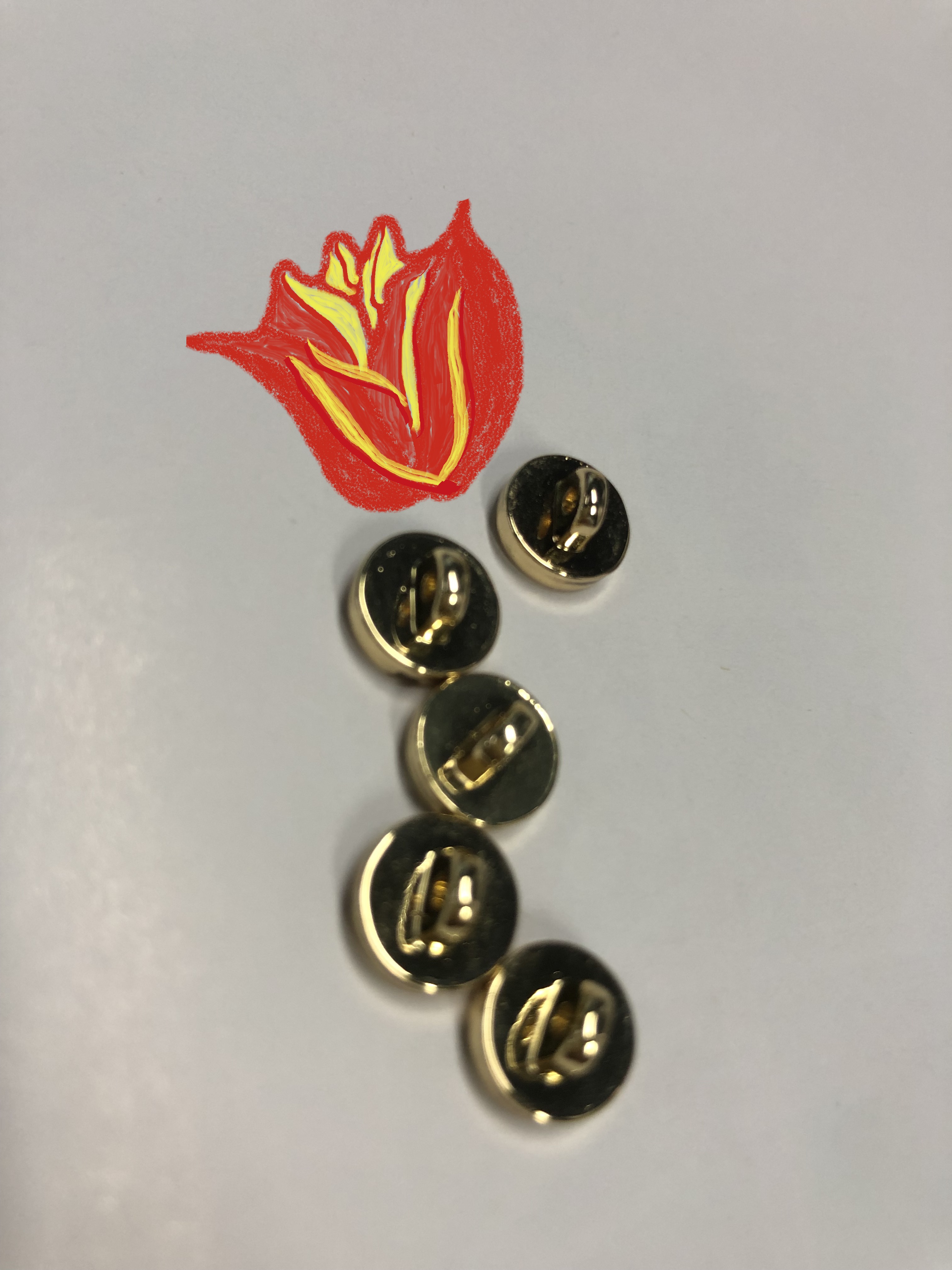
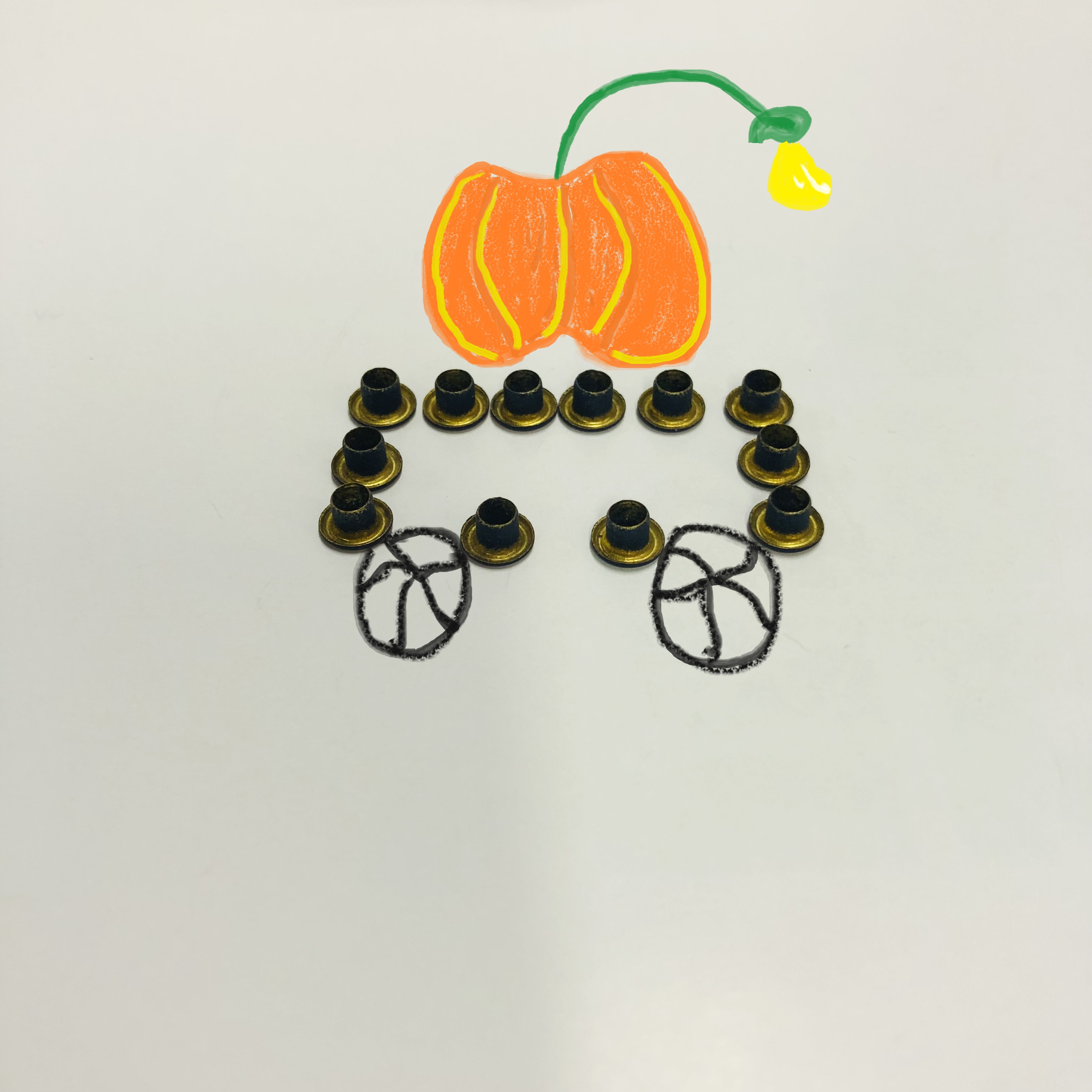
I drew a flower and placed a few gold buttons beside it. Looking at them together, I started thinking about the role a button plays in a garment.
We tend to think of buttons as finishing touches. They are chosen to match the fabric, complement the color, and keep everything in place. Once the garment is finished, we rarely give them a second thought.
But what if a button deserves more attention than that?
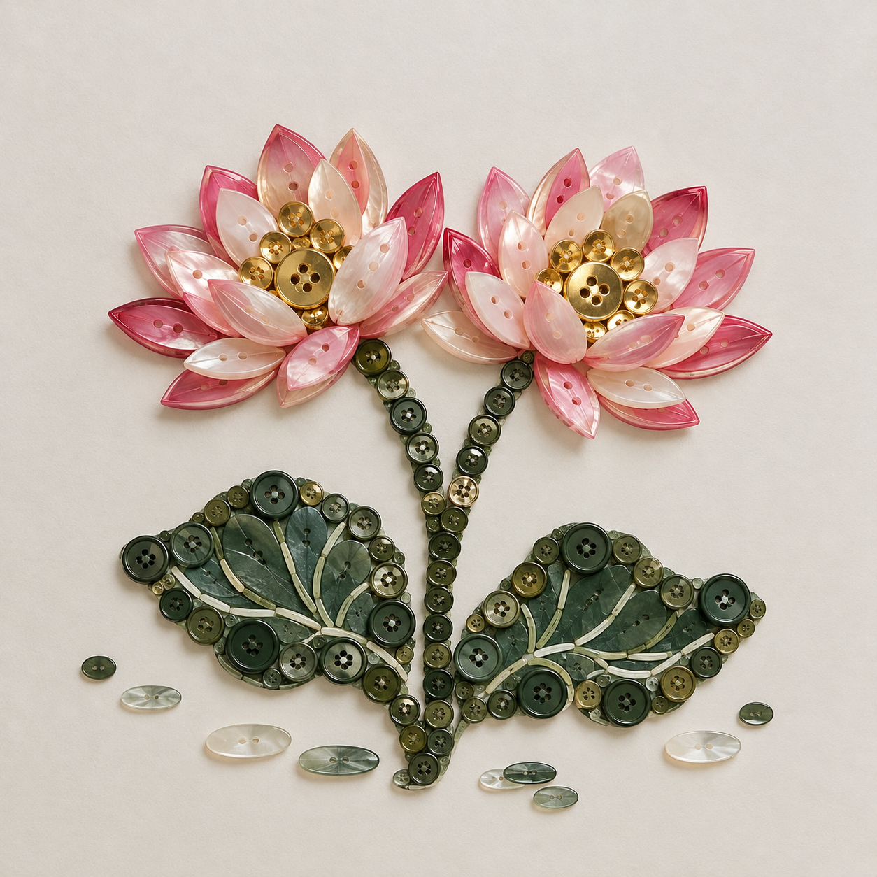
To me, a good button is a little work of art. It shouldn't always have to play the green leaf beneath a flower. Sometimes, it can be another flower altogether, blooming in its own colors.
And when the two come together, neither takes anything away from the other. Like two lotus blossoms growing side by side, they make each other feel complete.
When a Small Detail Catches Your Eye
Think about a gold button on a dark jacket. It catches the light when you move. It draws your eye without trying too hard.
Now imagine replacing it with a plain button in a similar color to the fabric. The jacket still works. It may even look perfectly good. But something has changed.
That little gold button has given the garment a different feel.
This is what I find fascinating about buttons. They don't need to be large or complicated to make a difference. Sometimes, it's the shape, the finish, or simply the way a button sits against the fabric that makes it stand out.
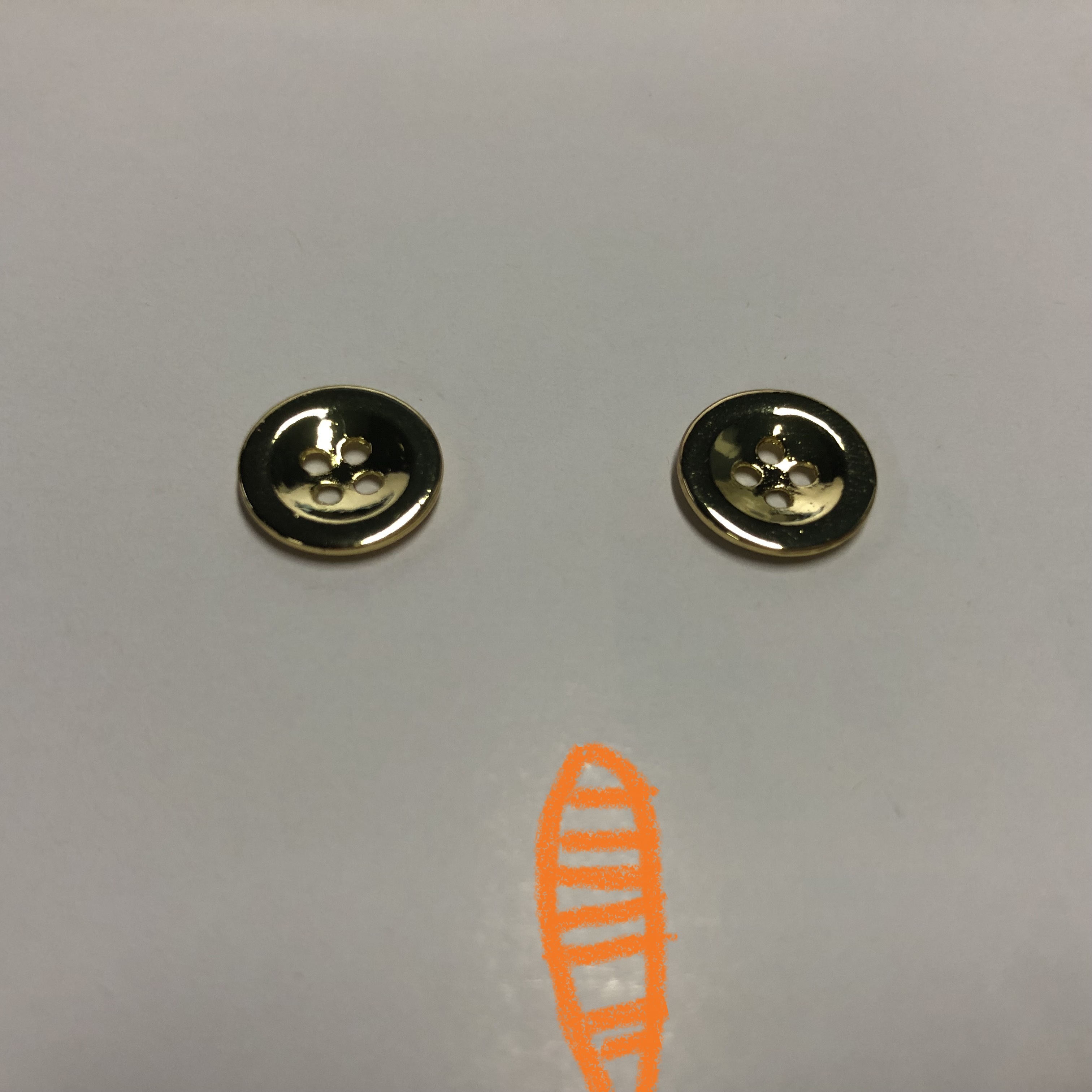
A shank button, for example, has a raised back that gives it a distinctive profile. A four-hole button may look familiar, but a change in its proportions, color, or surface can give it an entirely different character.
The button itself is small. The impression it leaves doesn't have to be.
Not Just There to Match
There's nothing wrong with a button that blends in. On some garments, that's exactly what you want.
But matching isn't the only way to create harmony.
A contrasting button can bring a plain jacket to life. A row of carefully chosen buttons can become part of a garment's visual identity. Even a simple shirt can feel different when the buttons have been chosen with the same care as the fabric.
The trick is knowing when to keep things quiet and when to let a detail speak.
I think that's where good design begins: not with adding more, but with seeing more in what is already there.
A button doesn't have to compete with the garment. It just needs to bring something of its own to the relationship.
A Button Can Tell a Story, Too
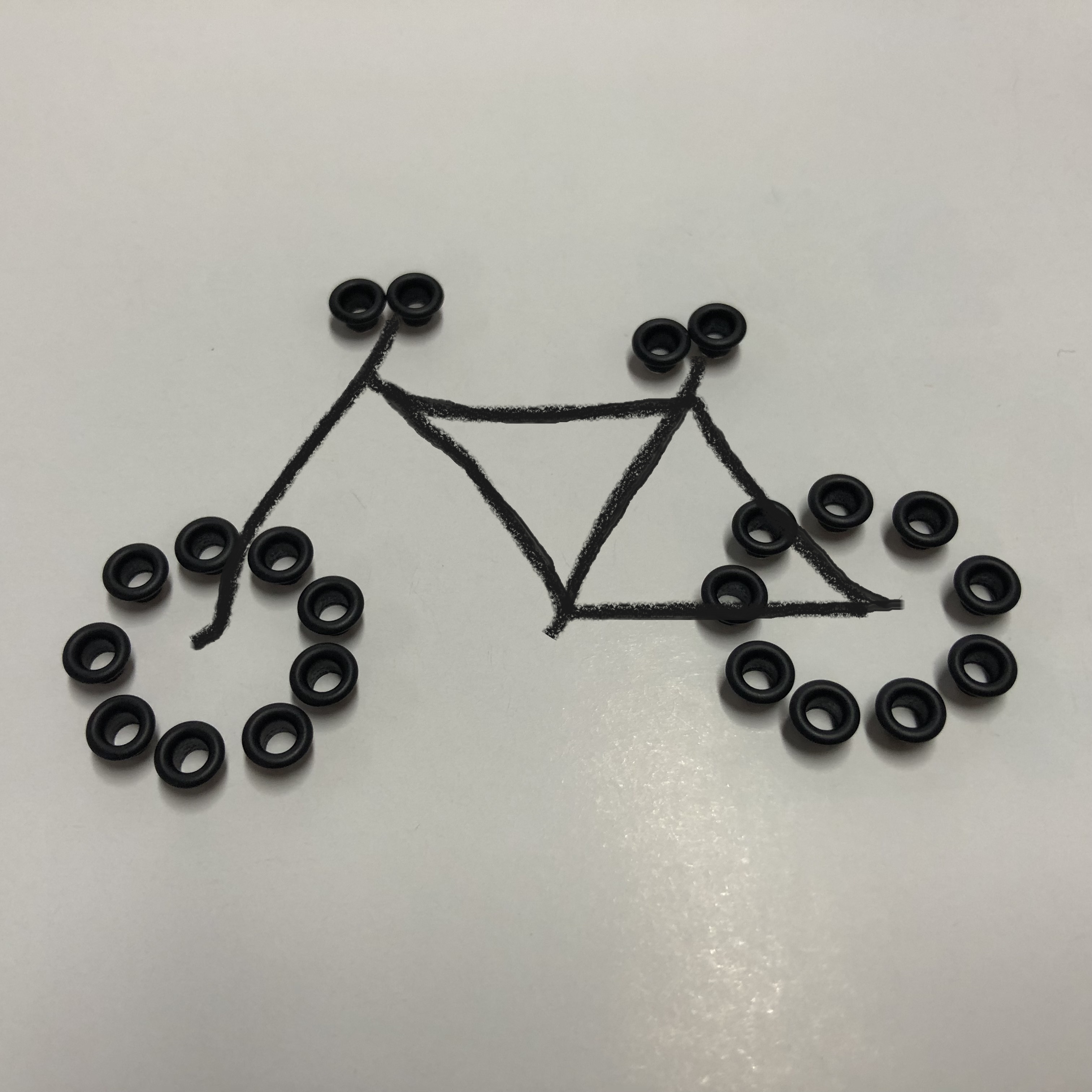
When I started arranging buttons into little drawings, I began to see them differently.
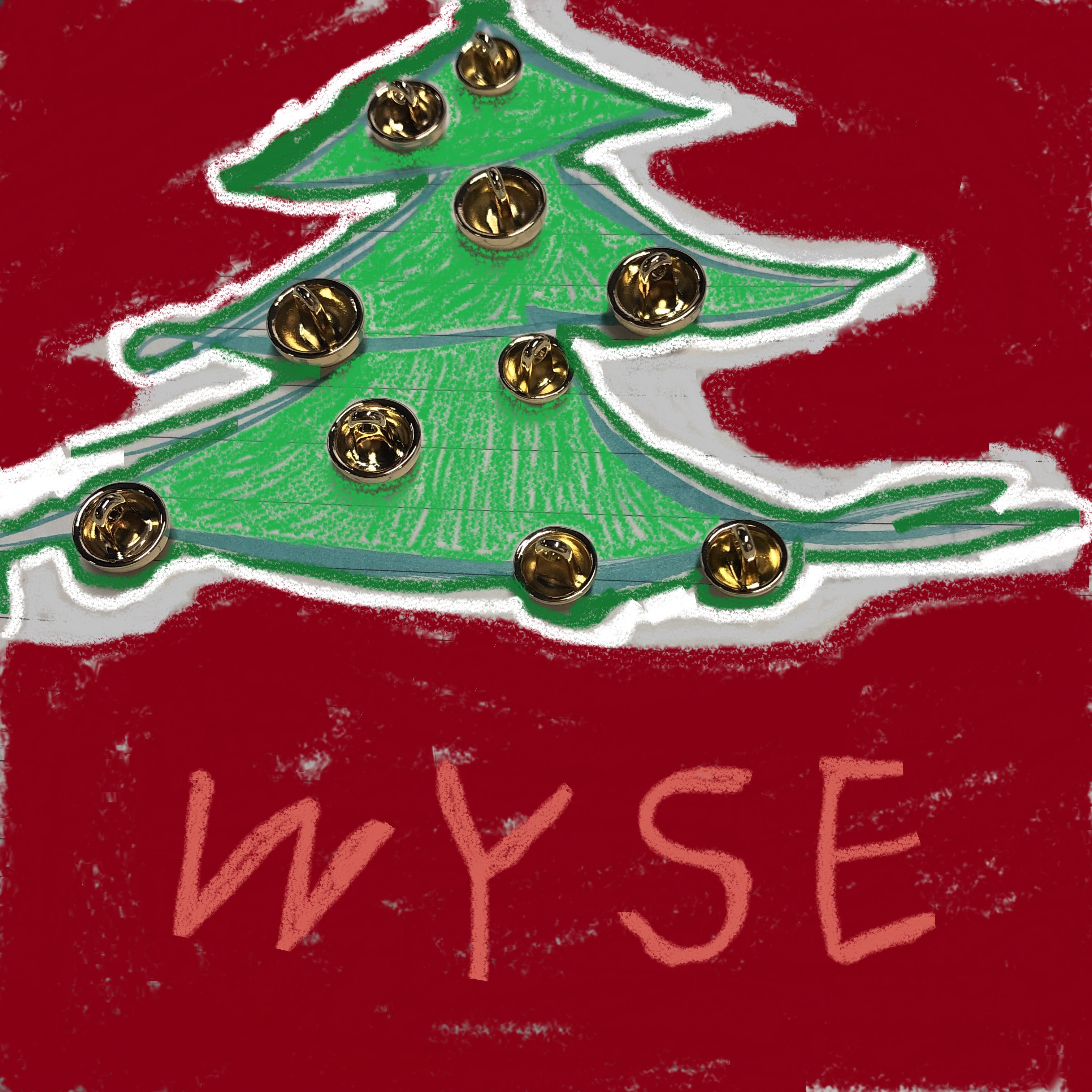
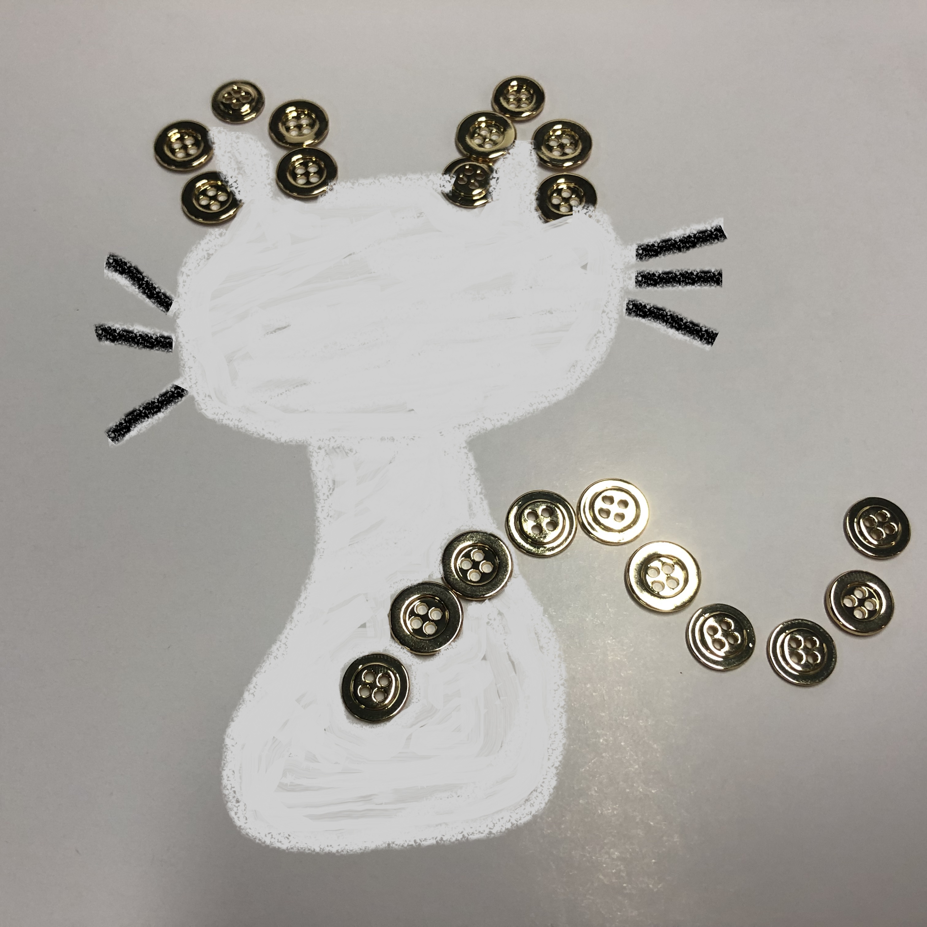
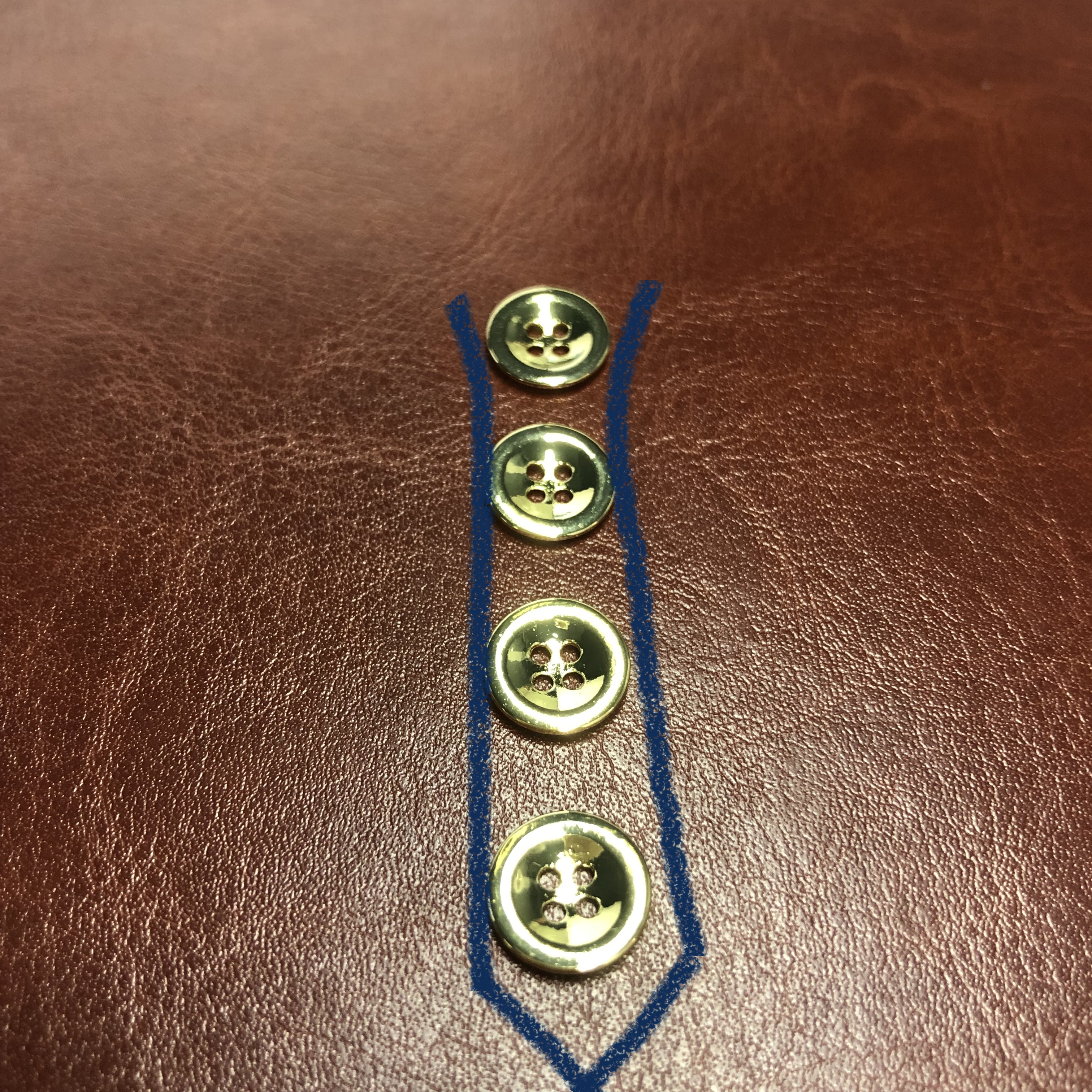
On a Christmas tree, gold buttons became ornaments. Beside a hand-drawn flower, they looked almost like small metallic petals. A handful of four-hole buttons could suggest the shape of a cat or form the outline of a tie.
These are simple ideas, but that's part of the fun. You take something ordinary, move it out of its usual setting, and suddenly it becomes something else.
The same way of thinking can find its way into fashion. A button can echo a pattern in the fabric, add a point of contrast, or become the detail people remember after seeing a garment.
Of course, not every button needs to make a statement. Some are at their best when you barely notice them. Others deserve to be seen.
What matters is that the choice feels right for the garment.
There's More to a Good Button Than Looks
As much as I enjoy the visual side of buttons, appearance is only part of the story.
A button also has a job to do. It needs to suit the fabric, work with the garment's construction, and meet the requirements of the finished product.
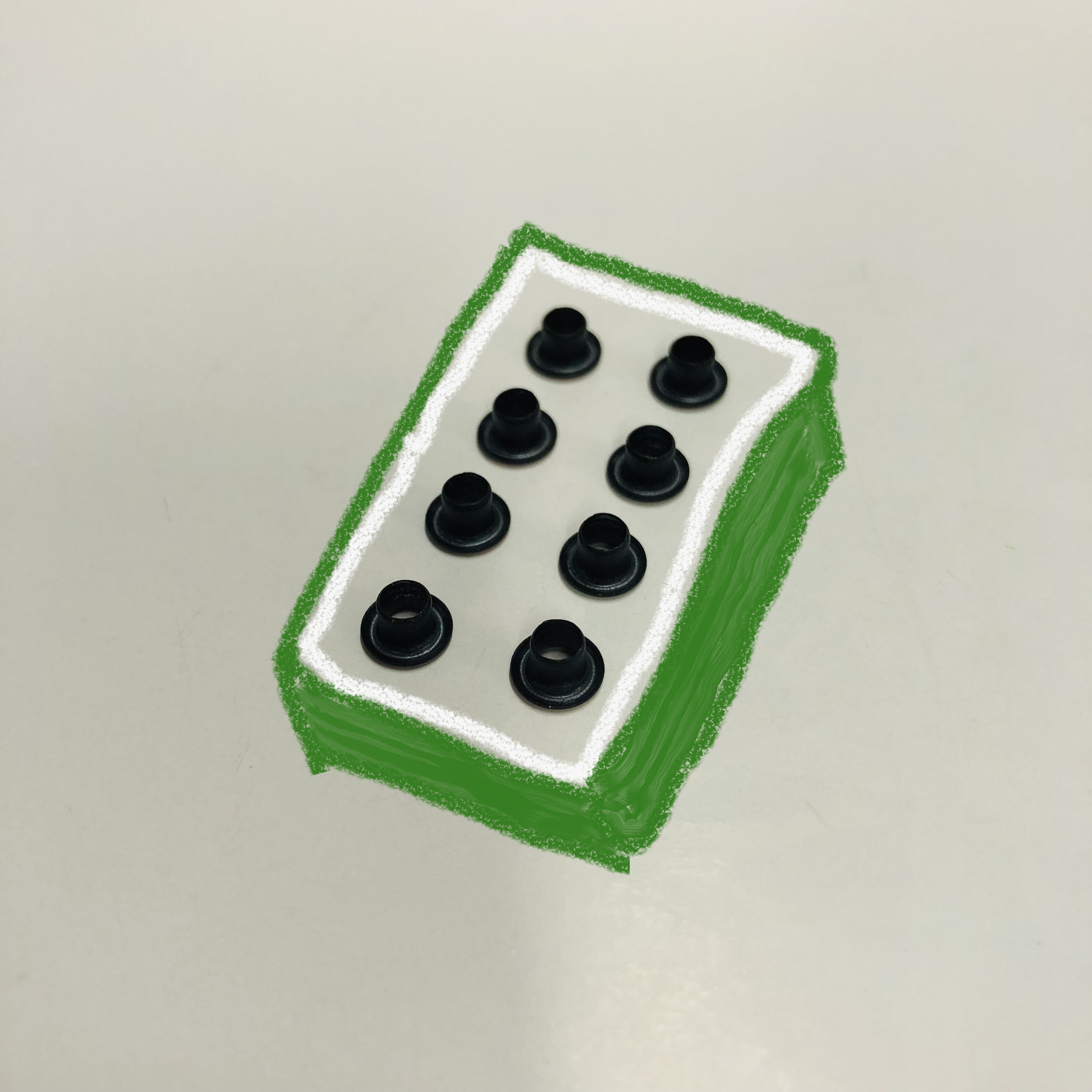
The same goes for other garment accessories. A zipper needs to function properly. A buckle needs to be suitable for its intended use. An eyelet needs the right dimensions and construction for the material it will be installed in.
And when a design moves into production, consistency matters. The buttons in a bulk order should meet the agreed specifications, not just look good in the original sample.
These things may not be obvious in a photograph, but they matter to the people making and buying the garments.
For a clothing brand, the right accessory has to do both: look the part and perform as expected.
That's why choosing buttons is worth a little more thought than simply picking a color that matches.
Two Blossoms, One Garment
I keep coming back to the image of two lotus blossoms opening side by side.
One is the garment. The other is the button.
The garment has its shape, fabric, and character. The button has its own color, texture, and form. They are different, but they belong together.
A beautiful button on the wrong garment may feel out of place. An otherwise well-designed garment with poorly chosen buttons may feel unfinished. But when the two are right for each other, the result feels effortless.
You may not even be able to explain exactly why it works. You just know that it does.
Perhaps that's what makes a well-chosen button special. It doesn't need to draw all the attention to itself. It simply needs to be there, adding something that would be missed if it were gone.
At WYSE, we work with garment accessories every day, including buttons, zippers, buckles, and labels. We know that behind each small component are practical decisions about materials, construction, finishes, and production requirements.
But we also know that these components are part of something bigger: a garment someone has spent time imagining and creating.
And that's how I like to think about a good button.
It isn't just there to hold two pieces of fabric together. It has a character of its own, a place in the design, and a reason to be there.
It can be the flower, not just the leaf.
And when the garment and the button bloom together, neither has to stand alone.